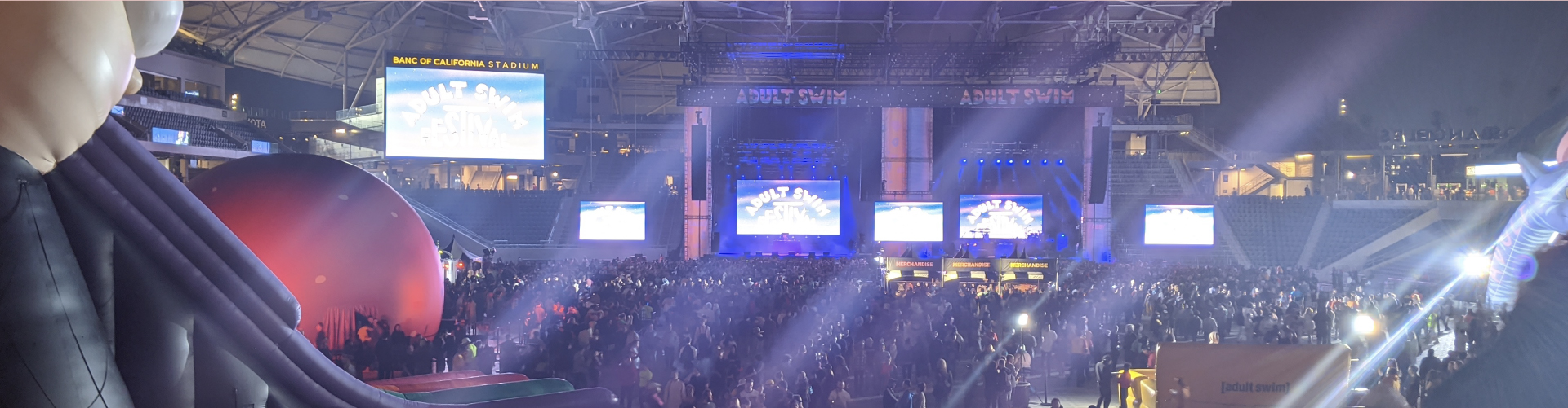
The Adult Swim Festival is a yearly music and comedy festival held in Los Angeles, CA, a celebration of all things Adult Swim— experimental, surrealist, absurd, awesome. Their 2019 lineup included Vince Staples, Captain Murphy (Flying Lotus), clipping., Dethklok, HEALTH, comedians Eric Andre and Joe Pera, and various panels and attractions like a five-story Rick and Morty inflatable slide, the Meatwad dome, dueling jousting cats, and a mechanical hot dog bull. You should have been there broh.
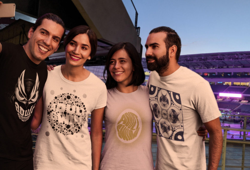
A contest was held by Adult Swim’s “How To Draw” show to design a shirt for the festival, limited to only one color each— these are what I came up with.
The whole of what Adult Swim is so varied and experimental that there’s no one set thing that defines it, everything’s seemingly held firmly with a lose hand. It’s antifomulaic, whatever you think Adult Swim is, it probably has been that and the exact opposite of that at some point, most likely at the same time. I wanted to take that sort of approach and make these concepts as varied as I could from one another, while paying homage to a few things from [as]’s history.
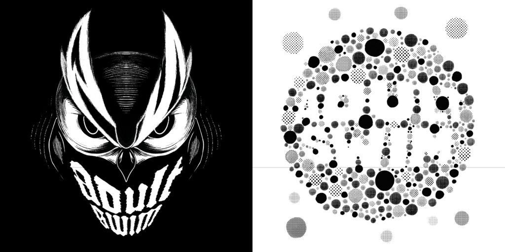
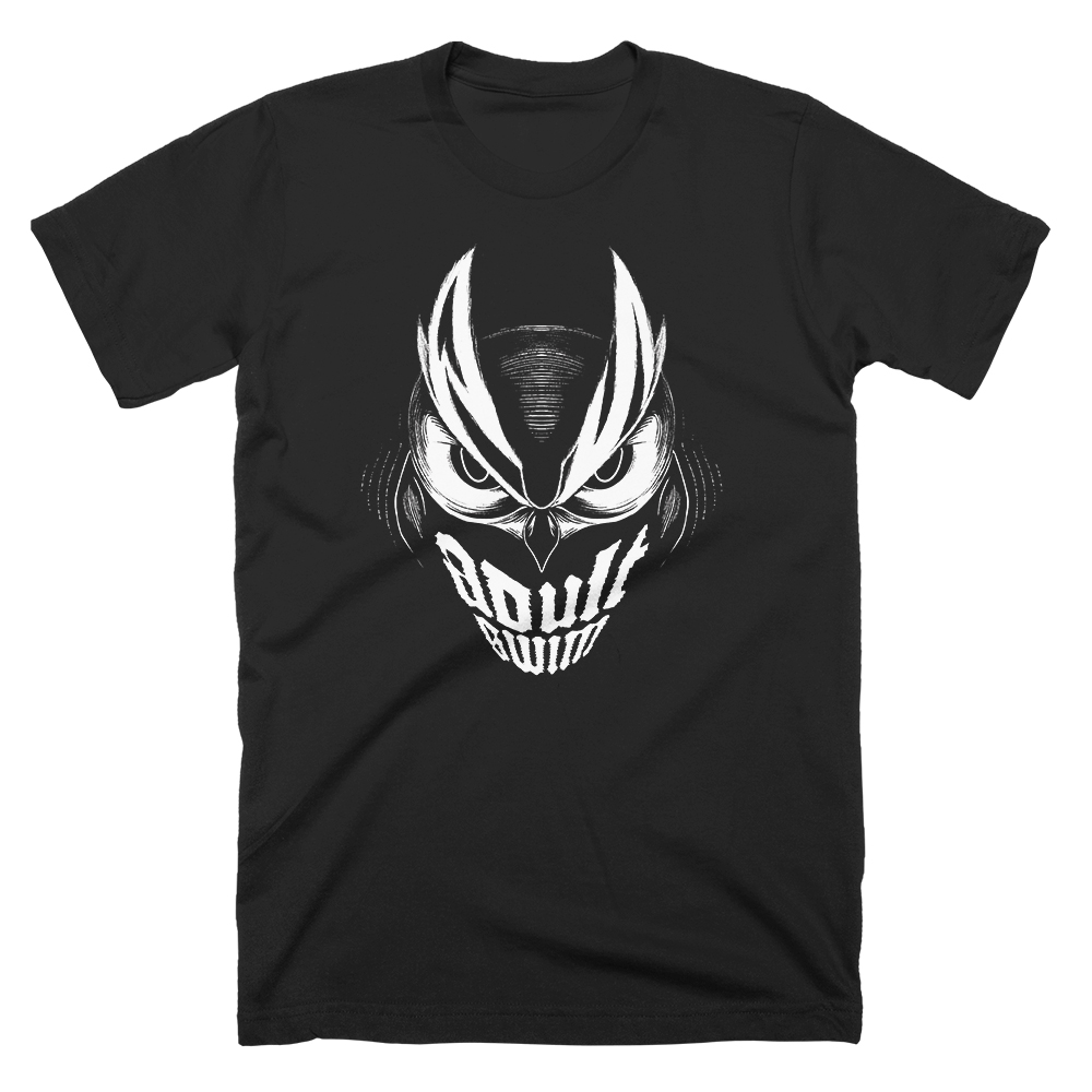
The great horned owl has been a staple of Atlanta GA, as well as Adult Swim, as far as staples go for them. Whether it’s because of their shared nocturnal activity, their ties to the occult, or just because they’re cool, owls have been a part of AS’s history, featuring them in ads, bumps, marketing stunts, music, to even building two 20-foot golden owls with laser eyes that could shoot smoke for one of their events before bringing one of them back to overlook the roof of their building. I wanted to pay homage to all that with this shirt— something fierce and piercing.
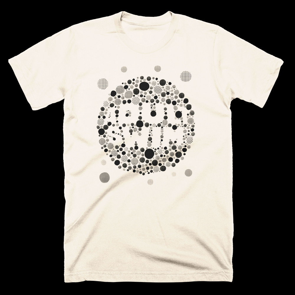
I wanted to design something tongue in cheek along the lines of a colorblindness dot test, where there would be a design obscured within another design that you could only see if you looked close enough— though trying to make that work for something where you WANT the obscured design to be visibly accessible while only using one color was the challenge. I ended up using halftone dots to get those multiple shades and using negative space to spell out “Adult Swim” to nail both of those issues, and that obscurity trick still works up close while still being legible from far away.
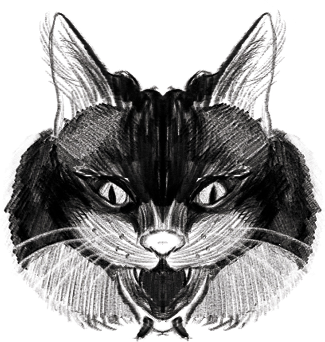
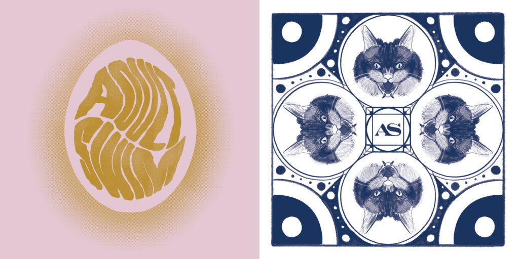
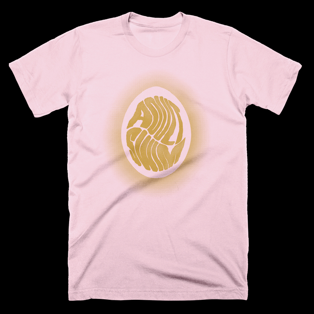
This design (left) is more of a homage to Adult Swim’s Singles Program, a yearly release of exclusive music. More specifically, this pulls from their 2015 program, where the creative team hand-painted and photographed multiple ostrich eggs for each cover artwork. The Singles Program is one of my favorite things Adult Swim has done, to the point where I designed a few faux covers following the style of their 2016 program.